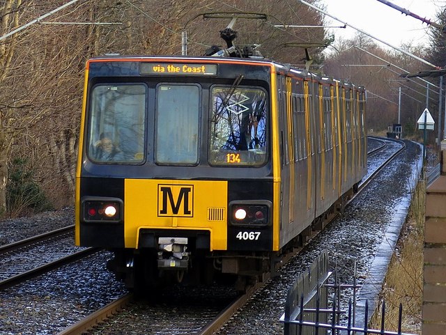
Metro train approaching Meadow Well Station
Introduction
The photograph on this page of Metro train approaching Meadow Well Station by Andrew Curtis as part of the Geograph project.
The Geograph project started in 2005 with the aim of publishing, organising and preserving representative images for every square kilometre of Great Britain, Ireland and the Isle of Man.
There are currently over 7.5m images from over 14,400 individuals and you can help contribute to the project by visiting https://www.geograph.org.uk

Image: © Andrew Curtis Taken: 18 Jan 2018
"Metro increasingly adopted the black 'M' as its logo, and it soon came to adorn the front and sides of the Metrocars. The Calvert typeface, and in particular the black 'M' on yellow background, became as locally distinctive markers of the Metro as the London Underground roundel is for Londoners. Outside Metro stations, you’ll now find totems with a yellow box at the top, each vertical side displaying a Calvert 'M' Image "M is for… Metro" - Calvert typeface and the Nexus Tyne and Wear public transport visual identity: https://thebeautyoftransport.com/2017/04/19/m-is-for-metro-calvert-typeface-and-the-nexus-tyne-and-wear-public-transport-visual-identity/

